
Product catalogue and order quantities
Item list
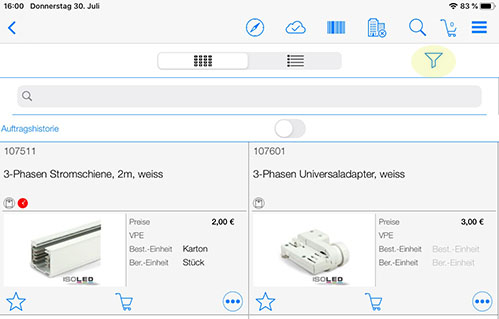
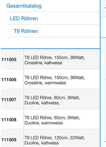
Within POLUMANA® there are various options available for viewing the items. The more detailed tile view is available by pressing the tile view icon . By pressing the list view icon in iOS, you will see the items within a list, but with slightly less information. In addition, the item image is not displayed in the list view. In Windows, you can view the item groups by clicking on the group icon.
| WIN | iOS | Function |
 |  | Tile view |
 |  | Item groups / List view |
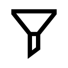
Item filter
You can use the Item filter to filter the display of items accordingly. You can see whether a filter has been set for the current item view or whether all items are displayed by the status of the funnel.
Meaning of the filter symbols:
| WIN | iOS | Function |
 |  | No selection. All objects are visible |
 |  | A selection is active. You do not see all objects |
Item favourites
In POLUMANA® you can make any items into item favourites. With the help of item favourites, you can combine these selected items into product recommendations.
| WIN | iOS | Function |
 |  | Make this item an item favourite or display all item favourites |
 |  | Add item favourites to product recommendation |
 | | Item is item favourite |
 |  | Delete all item favourites |
Shopping basket
Within the item view, you can add items directly to the shopping basket. If no customer has been activated yet, a customer list will appear when you click on the shopping basket symbol. The desired customer must be selected here.
| WIN | iOS | Function |
 |  | Add this item to your shopping basket |
 | This item is already in your shopping basket |
You can practise step by step how to add items to the shopping basket and carry out further operations with the shopping basket in the chapter Creating a shopping basket.
Item detail view
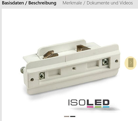
Clicking on the item takes you to the item detail view. Various tabs with information content are available to you in the item detail view.
By clicking on the item image icon within iOS, an item image (e.g. product data sheet) that has been entered specifically for this item is displayed, if available. The right arrow symbol is available for this purpose in Windows.
| WIN | iOS | Function |
 |  | Item image |
 Please note that the available views may differ depending on the item and customer-specific settings.
These tabs are available to you within the item detail view:
Tab: Item
In this tab, you can see an image of the item, the item number and the packaging unit. If a customer is already activated, you have the option of adding this item with the desired quantity to the shopping basket via the “Quantity PU” input field. If no customer is activated, the “Quantity PU” field is displayed but cannot be entered.
To activate a customer, click on the shopping basket in the item overview. You can select a customer in the following window.
Tab: Description
If available, the detailed description of the item is displayed in this tab
Tab: Features/Documents
The specified item features are displayed within this tab. A further document (e.g. technical data sheet) can also be added here. It is also possible to upload videos about this item.
Tab: Accessories/Similar items
If specified for this item, you will find corresponding accessories or alternative (similar) items here. You can also add items to the shopping basket from this view.
Product catalogue and order quantities
Within the item overview, you can also organise the catalogue by item groups. To do this, click on the Extension symbol. To return to the normal view, click on the Reduce icon.
When opening Windows, the extended item screen is displayed by default.
| WIN/iOS | Function |
 | Expand – extending / splitting the screen |
 | Reduce – reducing to normal screen view |
If you press the Expand icon, the screen splits into three views.
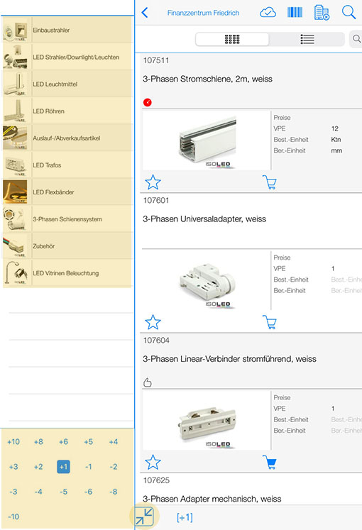
Order quantities and item groups have now been added to the item overview.
Within the order quantity area, you can select how many pieces should be ordered per item. For example, if the quantity is set to “+4” and you tap on the shopping basket, 4 pieces will be added.
The individual product categories or subcategories are displayed within the product group area. At the last level, the items belonging to the selected category are listed. Please note that an item hierarchy is displayed in the upper area based on the selection.
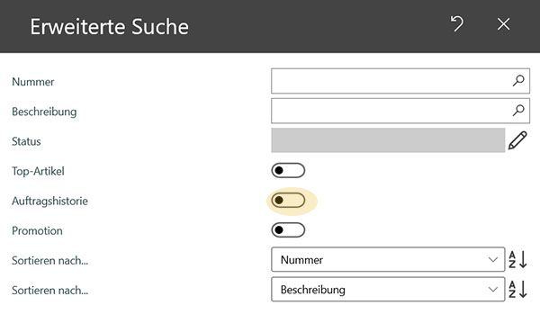
Order history
Items already ordered by the customer can be displayed via the order history button.
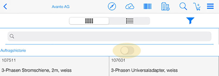
Please note that a customer must be activated for this function.
Within Windows, this switch is set via the search function in the item.
Item status
In POLUMANA®, items can have an item status. Below is a list of the possible statuses for items.
The item status is not set in POLUMANA®. The item status is imported from the corresponding source system (ERP).
| WIN | iOS | |
 |  | Route item |
 |  | Top product |
 |  | Vendor Managed Inventory -1 |
 |  | Vendor Managed Inventory -2 |
 |  | Power item |
 |  | Sale item |
 |  | Historical item (customer has already bought this item before) |
 |  | Item from complete offer |
 |  | Offer item |
 |  | New item |
 |  | Last viewed |
 |  | Campaign item |
 polumana® Online Help